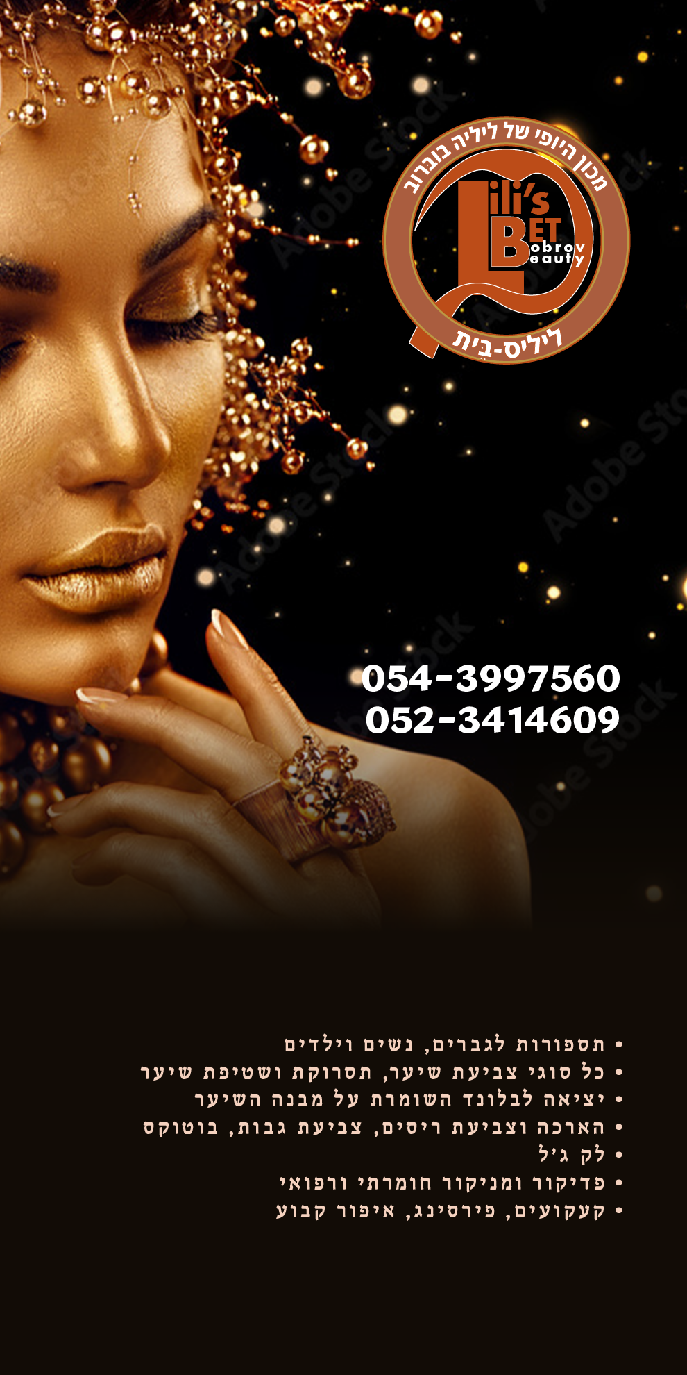
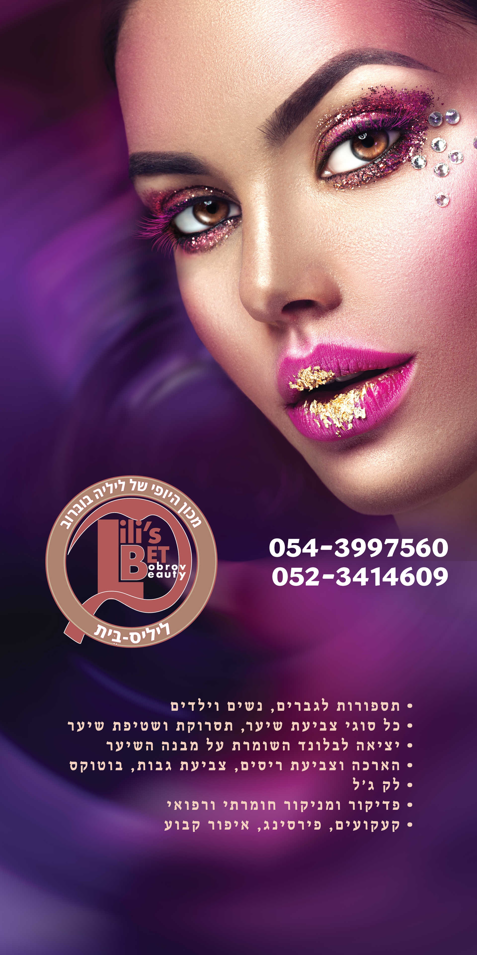
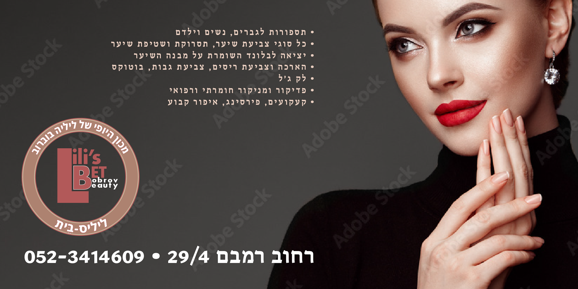
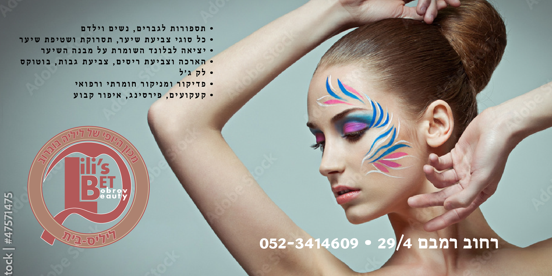
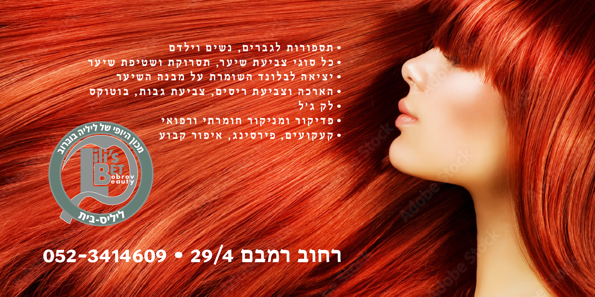
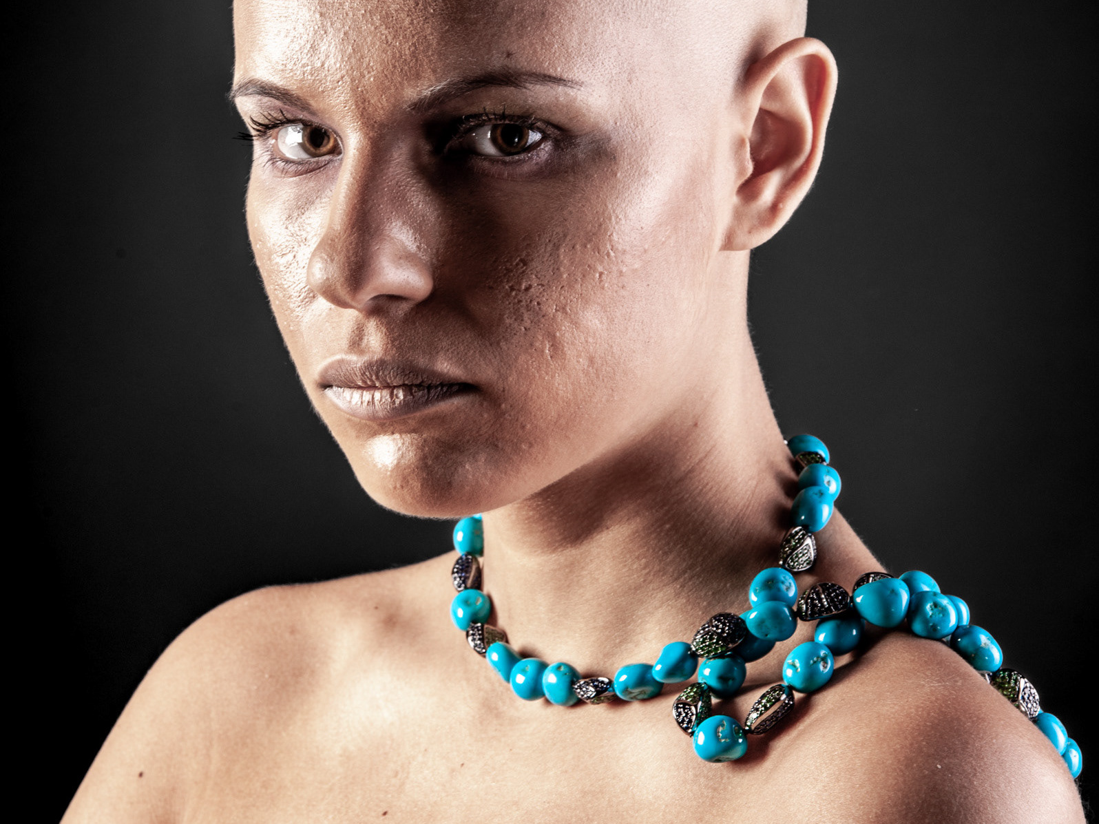
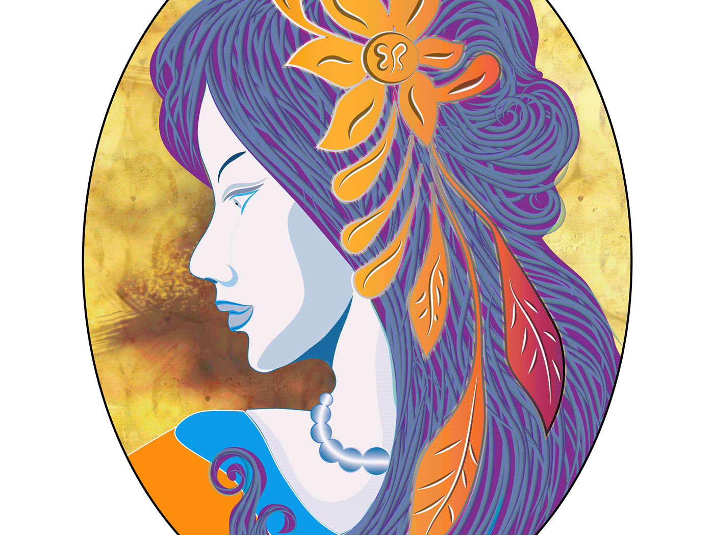
I had to design a banner measuring 1x2 m for the beauty salon in Beer Sheva. The customer has not an element of business identity, no name, no images, no logo - just nothing. Only name of the business owner - Lilia Bobrov.
Thus, the work includes naming, developing identity elements - logo, and graphic design.
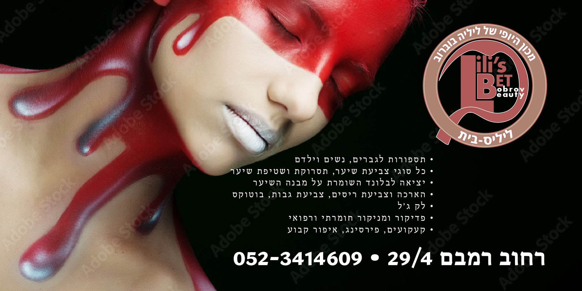
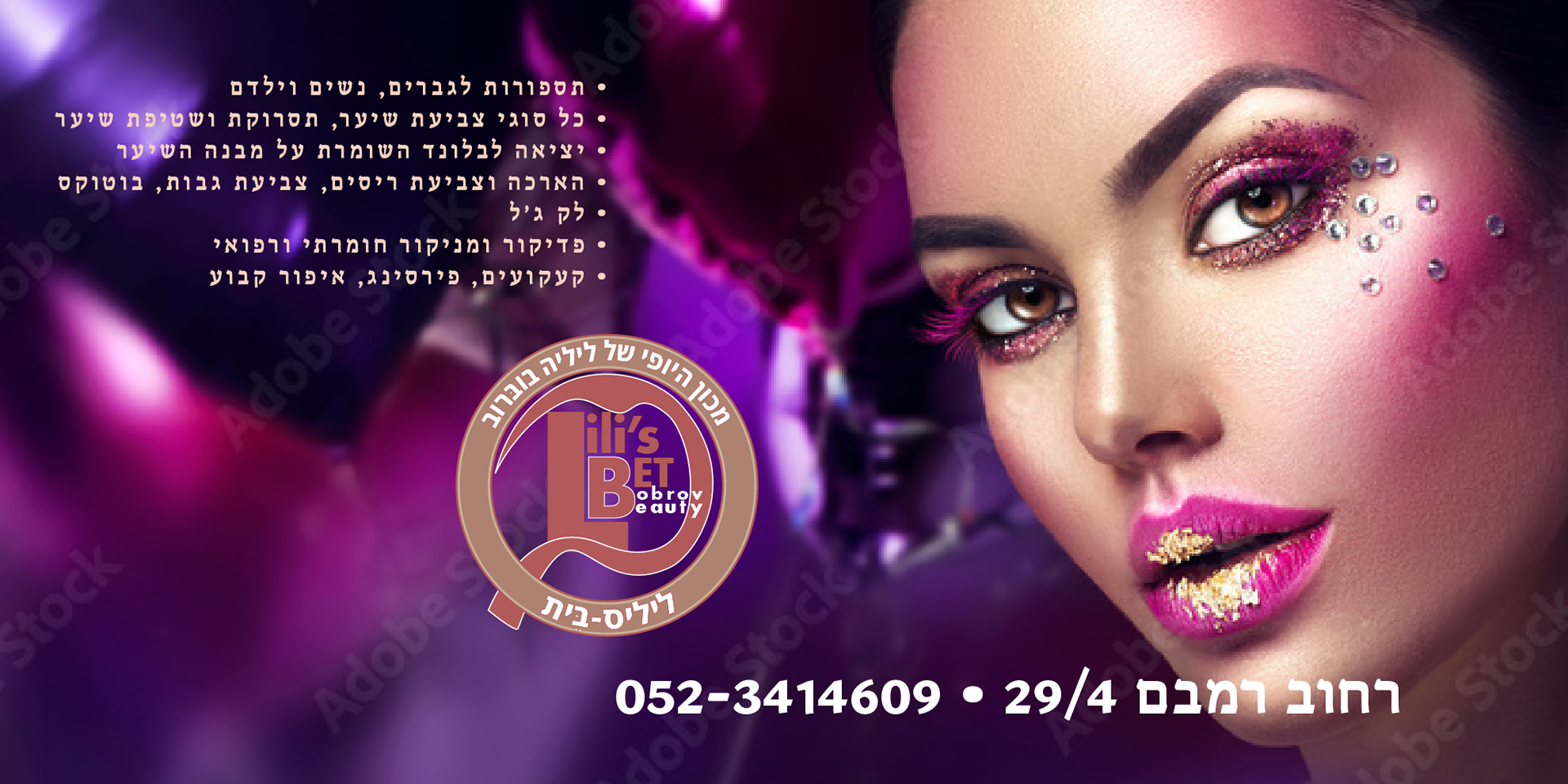
Due to very modest budget, we decided not to take a photo of our own, but to purchase from a stock. Therefore, the attached illustrations have Adobe Stock Watermarks. The licensed photo was purchased for the final version.
Naming was also performed without an in-depth examination of uniqueness and phonetic research.
I decided on the name of the Lili's-BET beauty salon. First, it sounds acceptable in Russian, English and Hebrew as well. Second, it looks like the name Lillibet - Elizabeth II's childhood nickname, popular after the TV series "The Crown", but most importantly, it's an anagram - Lili's Bobrov Beauty.
The logo consists of the Bauhaus-style font block, complemented with a stylish Hebrew letter "B" (removed in the abbreviated version), and also a ring-shaped vignette with the business name and it's meaning in Hebrew.
As illustrations, I give the logo image, and the same banner options offered to the customer. Due to some misunderstanding, the first sketches were in landscape orientation.
